Call-to-actions (CTAs) play a crucial role in website design and marketing. They are designed to guide website visitors to a desired action, such as filling in a form, making a purchase or signing up for a newsletter. Effective CTAs can increase conversion rates and increase user engagement. In this article, we will discuss what CTAs are, why they are important and how to use them effectively in your website design and marketing strategy.
Summary
- Call-to-actions are buttons or links that prompt visitors to take action.
- They are important because they increase conversion on your website.
- Choose words that are clear and action-oriented, such as "buy now" or "sign up".
- Make your call-to-actions visually appealing by using colour and contrast.
- Place your call-to-actions in strategic places on your website, such as above the fold and next to important information.
What are call-to-actions and why are they important?
CTAs are elements on a website that prompt visitors to take a specific action. This can range from clicking a button, filling in a form, downloading an e-book or making a purchase. The purpose of CTAs is to guide visitors to the desired action and persuade them to take it.
Effective CTAs are important because they can increase conversion rates and increase user engagement. They help direct visitors to specific goals and can improve the user experience. By using clear and attractive CTAs, you can increase the chances of visitors taking the desired action and eventually becoming customers.
How do you choose the right words for your call-to-actions?
Choosing the right words for your CTAs is essential to encourage visitors to take action. Here are some tips for selecting persuasive and actionable language:
1. Be concise and specific: Use short and clear words that describe the desired action. Avoid vague or general terms that may confuse the visitor.
2. Use active verbs: Use verbs that indicate action, such as "buy now", "sign up" or "get free". This encourages visitors to take immediate action.
3. Create a sense of urgency: Use words like "now" or "limited time" to create a sense of urgency and encourage visitors to take immediate action.
Examples of effective CTA words include "try it for free", "discover more", "sign up" and "buy now".
How do you make your call-to-actions visually appealing?
Besides the words you use, it is also important to pay attention to the visual aspect of your CTAs. An attractive design can grab visitors' attention and encourage them to take action. Here are some tips for creating visually appealing CTAs:
1. Use colour: Choose a colour that stands out and matches the rest of your website design. Contrasting colours can help make the CTA button stand out.
2. Choose an eye-catching font: Use a font that is easy to read and attracts attention. Avoid fonts that are too small or too decorative and difficult to read.
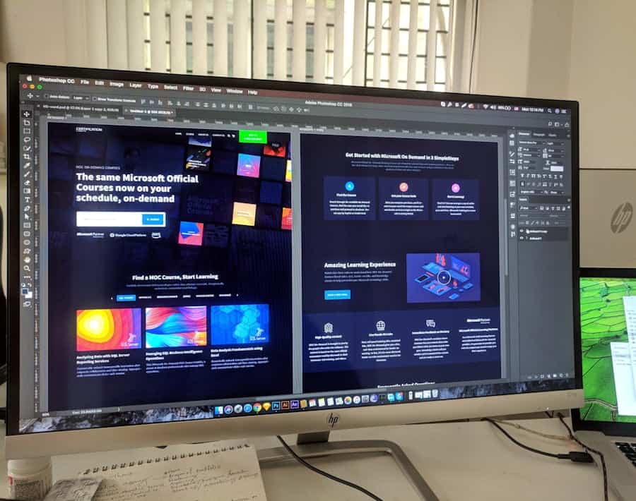
3. Include images: Use relevant images that support the message of your CTA. For example, this could be an image of the product you are promoting or an image that illustrates the desired action.
It is important to make sure your CTAs stand out and are easy to find on your website. Place them in strategic locations where visitors can easily see and access them.
How do you place call-to-actions in the right locations on your website?
The placement of your CTAs is crucial to their effectiveness. Here are some tips for identifying the best locations for your CTAs:
1. Above the fold: Place your most important CTAs above the fold, so visitors can see them directly without having to scroll. This increases the chances of them taking action.
2. Content-related: Place CTAs near relevant content, such as product descriptions or blog posts. This encourages visitors to take action based on the information they read.
3. At the end of the page: Place a CTA at the end of a page to encourage visitors to move on to the next step, such as filling in a form or making a purchase.
It is important to experiment with different sites and test which ones work best for your specific goals and target audience.
How do you use colour and contrast to make your call-to-actions stand out?
Colour and contrast play an important role in making your CTAs stand out. Here are some tips for selecting colours and creating contrast:
1. Choose contrasting colours: Use colours that contrast well with the background colour of your website. This helps make your CTAs stand out and easy to read.
2. Use an eye-catching colour for your CTA button: Choose a colour that differs from the rest of your website design to draw attention to your CTA button.
3. Use colour psychology: Consider the psychological effects of colour when selecting colours for your CTAs. For example, red can evoke feelings of urgency and action, while blue can convey trust and reliability.
It is important to experiment with different colours and contrasts to see which ones work best for your specific goals and target audience.
How do you use urgency to make your call-to-actions more effective?
Urgency is a psychological principle that can be used to make CTAs more effective. Here are some tips for creating urgency in your CTAs:
1. Limited-time offers: Indicate that an offer is only available for a limited time, e.g. "today only" or "limited stock". This encourages visitors to take immediate action not to miss out on the offer.
2. Countdown timers: use countdown timers to indicate how much time is left before an offer expires. This creates a sense of urgency and encourages visitors to take action quickly.
3. Social proof: Show how many people have already taken advantage of an offer or promotion. This can encourage visitors to also take action for fear of missing something.
It is important to be honest and transparent when creating urgency in your CTAs. Make sure the urgency is real and that visitors actually benefit from the offer or action.
How do you test the effectiveness of your call-to-actions?
Testing the effectiveness of your CTAs is essential to determine which ones work best for your specific goals and target audience. Here are some tips for testing your CTAs:
1. A/B testing: Create two versions of a CTA and test them against each other to see which performs better. For example, change the colour, text or placement of the CTA and measure which version produces the best results.
2. Analyse the results: Keep track of how many clicks, conversions and engagement each CTA generates. Analyse this data to determine which CTAs are most effective.
3. Keep optimising: Keep experimenting and optimising based on the results of your tests. Test new CTAs regularly to make sure you are always using the most effective options.
It is important to be patient when testing your CTAs and to keep testing and optimising regularly to get the best results.
How do you use personalised and relevant call-to-actions?
Personalised and relevant CTAs can increase user engagement and boost conversion rates. Here are some tips for personalising your CTAs:
1. Segmentation: Divide your target audience into different segments based on demographics, behaviour or interests. Adjust your CTAs based on these segments to make them more relevant to each group.
2. Dynamic content: Use dynamic content to customise your CTAs based on the actions or interests of individual users. This could include, for example, showing different CTAs to visitors who have already made a purchase versus visitors who have not yet made a purchase.
3. Location-based personalisation: Customise your CTAs based on the user's location. This could include, for example, showing different CTAs to users in different countries or regions.
It is important to use relevant and personalised CTAs to increase user engagement and conversion rates.
How do you use the right tone of voice for your call-to-actions?
The right tone of voice is important when creating effective CTAs. Here are some tips for selecting the right tone of voice:
1. Know your target audience: Understand who your target audience is and what tone of voice suits them best. Adjust your CTAs based on this knowledge to make them more relevant and appealing.
2. Be consistent: Make sure the tone of voice of your CTAs is consistent with the rest of your brand and website. This helps build trust and recognition among users.
3. Be clear and concise: Use simple and clear language in your CTAs. Avoid jargon or complicated sentences that can cloud the message.
It is important to use the right tone of voice to get the desired response from users and create a positive brand experience.
How do you use different types of call-to-actions for different purposes?
There are different types of CTAs you can use, depending on your specific goals. Here are some examples of different types of CTAs:
1. Clickable buttons: These are the most common forms of CTAs and are usually displayed as buttons with text such as "buy now" or "sign up".
2. Forms: These CTAs encourage visitors to fill in a form, for example to sign up for a newsletter or request more information.
3. Pop-ups: Pop-ups are windows that appear on a website encouraging visitors to take a specific action, such as completing a survey or downloading an e-book.
It is important to use the right type of CTA to stimulate the user's desired action. A CTA can take different forms, such as a button, a link, a form or a pop-up. Choosing the right type of CTA depends on the specific objectives and the desired behaviour you want to achieve. For example, if you want users to subscribe to a newsletter, a form with a "Subscribe" button may be effective. If you want users to buy a product, a button with "Buy now" or "Add to cart" may be the best choice. It is important to make the CTA clear and attractive so that users are encouraged to take action.
Are you looking for tips on how to implement effective call-to-actions on your website? Then the article "How to Implement Call-To-Actions Effectively?" on Webtik.co.uk is highly recommended. This article discusses various strategies and techniques for successfully implementing call-to-actions. Want to know more about the importance of a good call-to-action? Then click here: https://webtik.nl/inloggen/. Wondering how to get a website quote? Read all about it in this article: https://webtik.nl/website-offerte-ontvangen/. You can also find useful web design tips for creating a successful website: https://webtik.nl/webdesign-tips-voor-een-succesvolle-website/.
FAQs
What are Call-To-Actions?
Call-To-Actions (CTAs) are buttons, links or other visual elements on a website or in an e-mail that prompt visitors to take a certain action, such as filling in a form or buying a product.
Why are effective CTAs important?
Effective CTAs can increase the conversion rate of a website or email campaign, which can lead to more leads, sales and revenue. They help visitors take the desired action and can improve the user experience.
How to create effective CTAs?
Effective CTAs are clear, eye-catching and relevant to the content of the page or e-mail. They should describe a clear action and create a sense of urgency. It is also important to place the CTA in the right place on the page and test which colours, text and shapes work best.
What types of CTAs are there?
There are different types of CTAs, such as buttons, links, forms, pop-ups and banners. The type of CTA that works best depends on the content of the page or e-mail and the purpose of the campaign.
How do you measure the effectiveness of CTAs?
To measure the effectiveness of CTAs, you can use tools such as Google Analytics or heatmaps. These allow you to see how many people clicked on the CTA and which pages generate the most conversions. It is important to analyse the results regularly and adjust the CTAs if necessary.